Chilterns Conservation Board
Branding and marketing communications
To modernise the overarching look and feel of The Chilterns Conservation Board branding – the public body conserving and enhancing the Chilterns Area of Outstanding Natural Beauty (AONB) – we completely transformed their brand with a brave, dynamic design and accompanying colour palette.
The task was to develop a fresh identity that combined their heritage with a contemporary feel. A modern typeface led the way on the identity, alongside a refreshed colour palette and graphical brand stamp. This stamp was designed to reflect the three key features of the Chilterns; the escarpment, the rolling fields and the chalk streams.


Implementing the brand …
Following on from the brand identity creation we designed exciting new concepts for a suite of marketing communications for the flagship ‘Outstanding Chilterns’ quarterly magazine, annual review brochure, management plan, walking leaflets, stationery, infographics and signage.
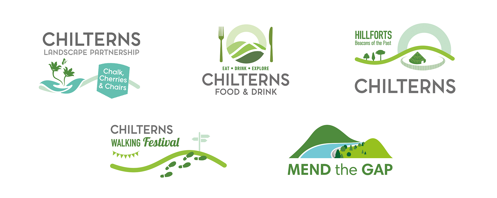
Taking the lead from the main logo we also created a suite of sub-brand logos to promote specific events and project work around the Chilterns. These include: Beacons of the Past; Chalk, Cherries and Chairs; and Mend the Gap.
Our relationship with The Chilterns continues to bloom, and we are soon to be launching their brand new website. Watch this space!


